Eight CSS fundamentals no one teaches us
When learning to develop for the Web, do you ever feel like you're being taught about all the tools in a toolbox, but not how to actually use them together to build something? If you want to assemble a shed, it's all well and good learning how to use a power drill to drill a hole in a plank of wood, but how do you use that tool along with a screwdriver, a saw to actually build a wall or a roof or a door?
That's how I felt when I was learning CSS ten years ago. It's empowering to know how to make the font size bigger, centre the text and float an image to the left, but how do you make navigation bar links appear side-by-side? And how do you make position: absolute content be positioned relative to what you want? And why is it that when you add a margin to a div element, it works, but when you add a margin to a strong element, nothing happens?
Without a grasp of the fundamentals of how CSS works, most of the many 'tools' we have in CSS don't make any sense. It makes anyone who's new to CSS feel like they're herding sheep.
These are eight foundational things about CSS that I think make it much easier to understand once you're aware of them.
1. Everything is a box permalink
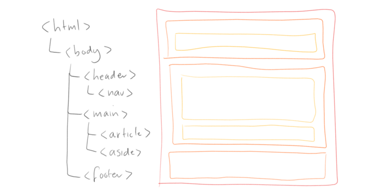
After downloading some HTML, your user's Web browser parses it and creates the DOM, or Document Object Model. This is a tree of all the HTML elements on a page. The browser then takes all of these elements in the DOM, and turns them into boxes!
Unless an element is hidden, it will be rendered as a rectangular box. Whether it's a table element, a div element, a p (paragraph) element, an li (list item) element or even a cheeky em (emphasised text) element, it will get turned into a box by the browser.
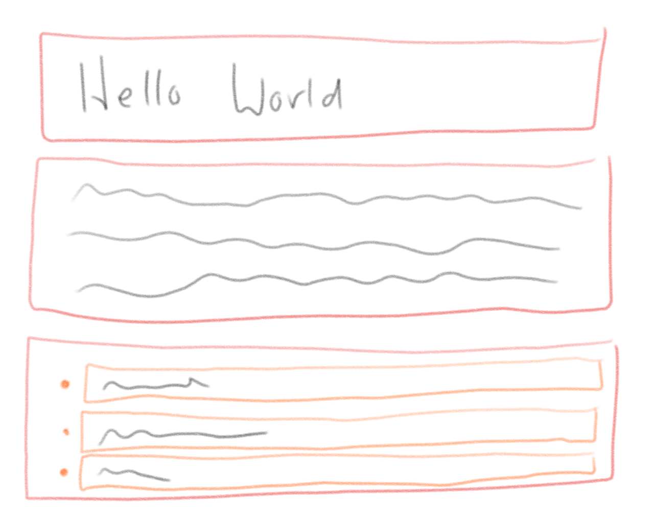
We can see this for ourselves by adding a border around every element.
* {
  border: thin solid red;
}
2. Every box is laid out in 'the flow' by default permalink
There are different types of boxes in our toolbox. Inline boxes, block boxes, flex boxes, grid boxes, table boxes, list-item boxes, inline-block boxes, inline-grid boxes, inline-flex boxes....
There's quite a lot! But these can be drilled down into two categories:
- Block boxes
- Inline boxes
Block boxes are boxes that appear one after the other. This blog post starts with a block containing the heading, a block containing an image, a block containing a paragraph, a block containing a sample of code and so on.
Inline boxes are boxes that appear - as their name would suggest - within lines of text. If some text is emphasised, that means it is in a inline box with the CSS property font-style: italic set on it.
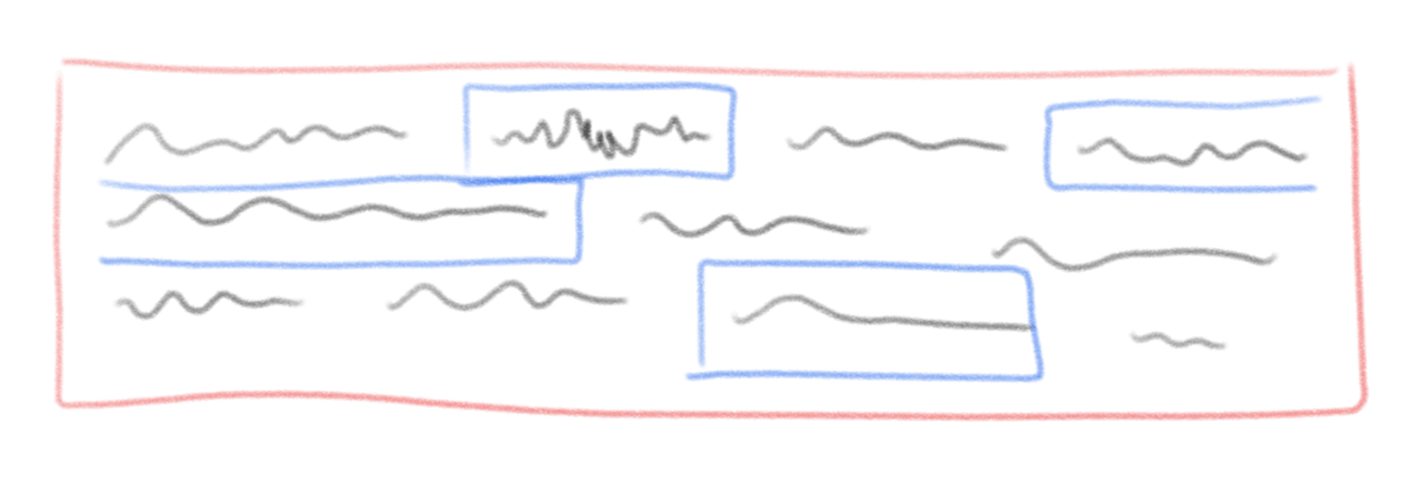
The CSS display property is used to set which type of box a box will be.
.poster-image {
  display: block
}
What about all those other types of boxes like grid, flex and table? This is where it gets a bit confusing, because they aren't the types of boxes; they set how the inner boxes are laid out! Recently, the way the display property works got updated to better reflect this. You can now specify a display-outer and display-inner.
For example, display: block is the same as writing display: block flow. block is the display-outer (the type of block) and flow is the display-inner (the way that the inner boxes are laid out). The flow value is the default layout method that we're used to, where all blocks appear one after the other, but we could change it to grid, enabling things to be laid out very differently! You can read up on different layout methods on MDN.
3. Every box follows the Box Model permalink
Boxes are actually made up of four layers. Starting in the middle, we have:
- the content box
- the padding box
- the border box
- the margin box
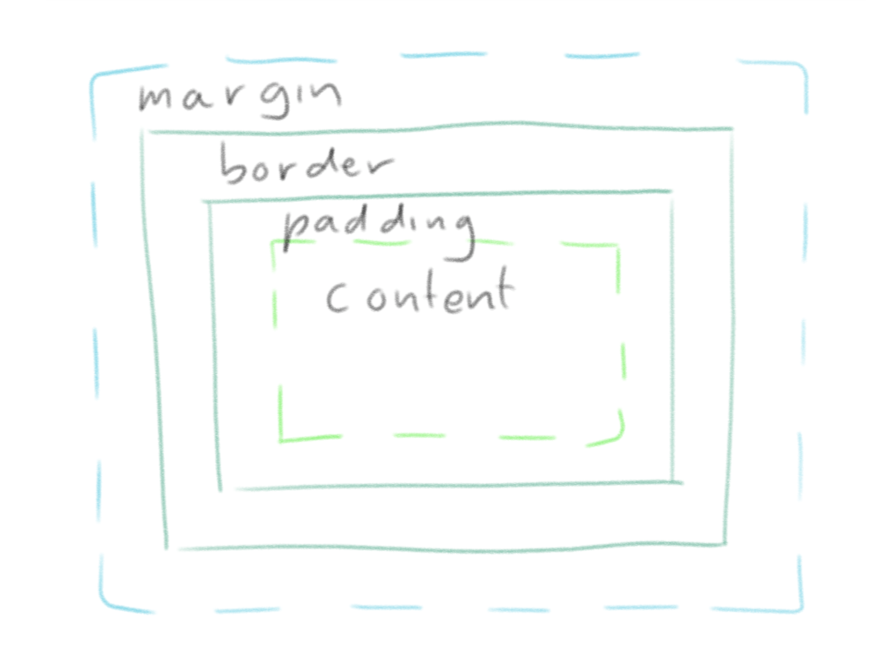
Most browsers' developer tools will show you a diagram like the one above when you inspect an element. You can of course set the width of these boxes using the width/height, padding, border-width and margin properties, respectively.
4. Width and height size the content box by default permalink
When you use the width and height properties to set the size of a box, you're actually setting the size of the content box.
To picture how boxes are sized in the box model, I always imagine someone pushing against the sides of the box. To set the size the box, they're pushing against the edges of the content box.
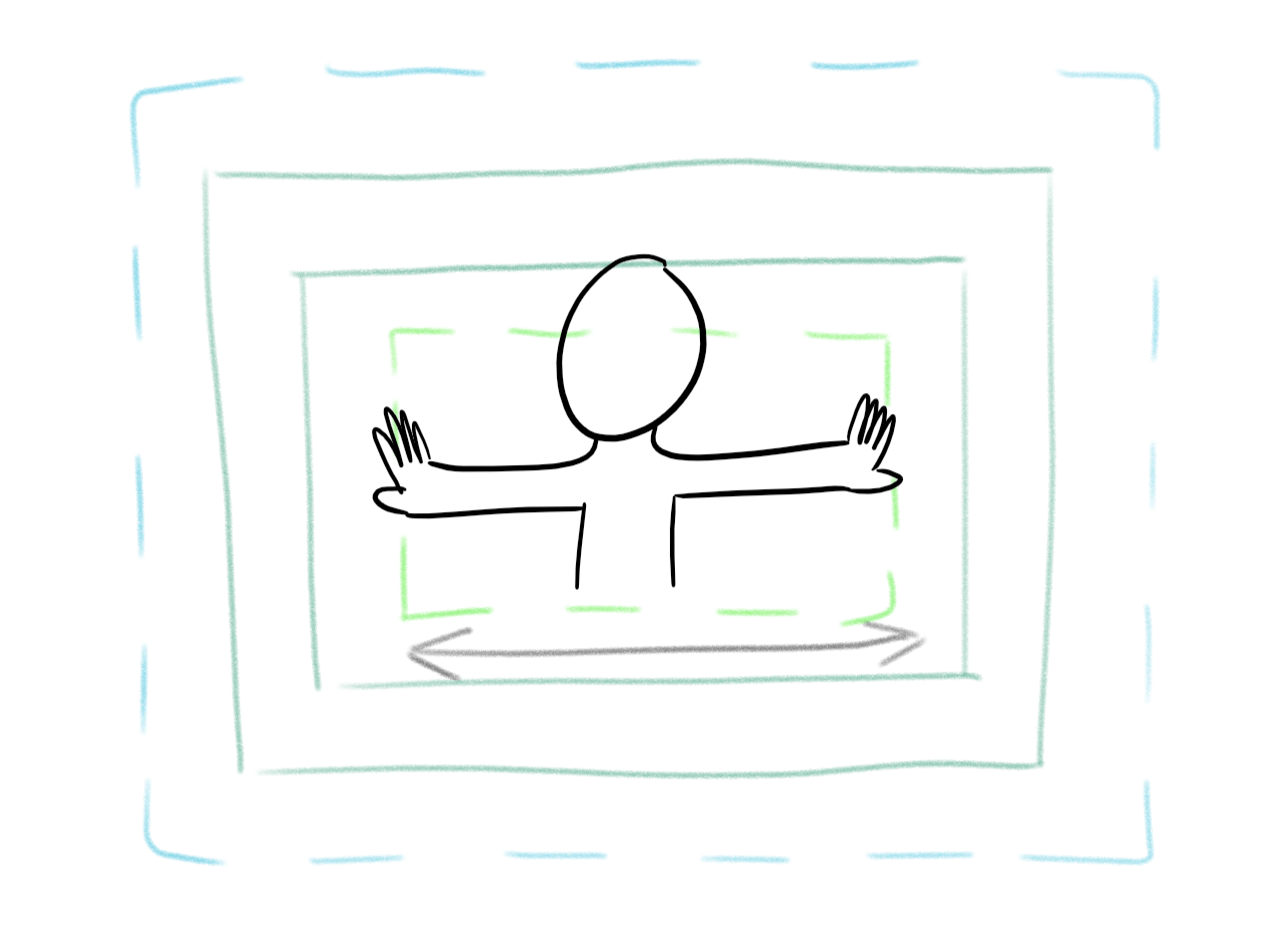
You can change this behaviour very easily with a CSS property called box-sizing. By default, it's set to box-sizing: content-box, but you can change the value to border-box. This will cause the box to be sized by pushing against the border box, which can make a lot more sense in some situations.
5. Margins can overlap each other! permalink
This one throws everyone off guard! Top and bottom margins can collapse into each other.
How big do you think the gap between these two paragraph boxes will be?
<style>
  p {
    margin-top: 1em;
    margin-bottom: 1em;
    border: thin solid green;
  }
</style>

<p>How big…</p>
<p>…is the gap?</p>
You might expect it to be a 2 em gap, but it's actually only one! The margins collapse into each other. This is true even if one of the boxes is a child rather than a sibling.
<p>The gap is still…</p>
<div>
  <p>…only 1em</p>
</div>
This can cause a lot of confusion, so it's good to be aware of it.
6. You can change what an absolutely positioned box is positioned relative to permalink
I'm sorry for the very confusingly worded heading.
Using the CSS property position: absolute allows you to position a box anywhere on the page, which is very useful!
<style>
  button {
    position: absolute;
    top: 1em;
    right: 1em;
  }
</style>

<body>
  <button>Close</button>
</body>
But what if you want the box to be positioned relative to another box rather than the whole page? You can do that by setting the position property on one of its containing boxes.
<style>
  .ad {
    position: relative;
  }

  .ad button {
    position: absolute;
    top: 0;
    right: 0;
  }
</style>

<body>
  <aside class="ad">
    <img src="free-pizza.jpg" alt="Free pizza!!!">
    <button>Close</button>
  </aside>
</body>
7. Pseudo-elements don't appear unless they have content inside permalink
A pseudo-element is a box that doesn't actually exist in the HTML DOM. They are created with a selector that has something like ::before or ::first-letter in it.
Some pseudo-elements like ::first-letter wrap existing content in a box so that you can style it more easily.
<style>
  p::first-letter {
    float: left;
    font-size: 2em;
  }
</style>

<p><::first-letter>H</::first-letter>ow Aberystwyth is tackling the problem of
seagull litter</p>
Other pseudo-elements like ::before and ::after don't have any content.
<style>
  .note::before {
    content: 'Note: ';
  }
</style>

<p class="note">The cake is a lie.</p>
If we don't include the content, the pseudo-element won't render.
<style>
  h2::before {
    /* We're creating an empty string of content so that this will render. */
    content: '';

    display: block;
    width: 90%;
    border-top: thin solid grey;
  }
</style>

<h2>Today's weather forecast</h2>
<p>It's terrible.</p>
8. The browser has a default HTML stylesheet permalink
Every CSS property has an 'initial' setting that's applied to all elements by default. Text color is always black. Font weight is always normal. Box padding is always 0.
So why is it that, on Web pages, hyperlinks are always blue and underlined, headings are always blocks with a large bold font and keyboard focused elements always have a dotted border around them?
The answer is that every browser has a default stylesheet used on every HTML document.
It varies slightly between each browser, but it's mostly the same. You can check it out in the HTML specification's Rendering section.